Name: Angela
Bio: Angela loves the many subtleties languages carry, appreciates being bilingual and strives to be fluent in Chinese and French. She is currently working on a short story in addition to writing for the Smashion Babble fashion blog and the Michigan Daily at the University of Michigan – Ann Arbor, where she studies English and Psychology. After graduation, she plans to work as a journalist and write about what she finds passionate. In her free time she loves to get buzzed on wine, play guitar and sing. She’s also an ardent advocate of vintage fashion items. Angela, herself an artist, is thrilled to discover local women artists with Art Animal.
Posts by ason:
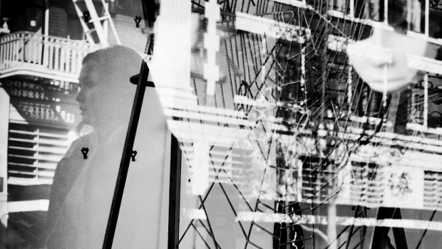
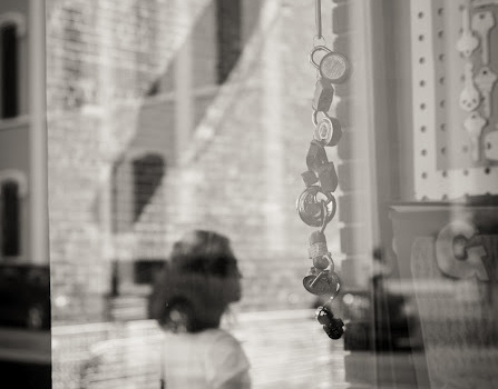
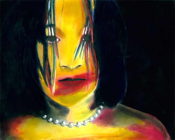
"I explore the abstract qualities the complicated layers create, and this is not an easy image to look at with its multiple layers – the reflection of a building, woman, spider web, and mask. It was done in one shot, with no manipulations."
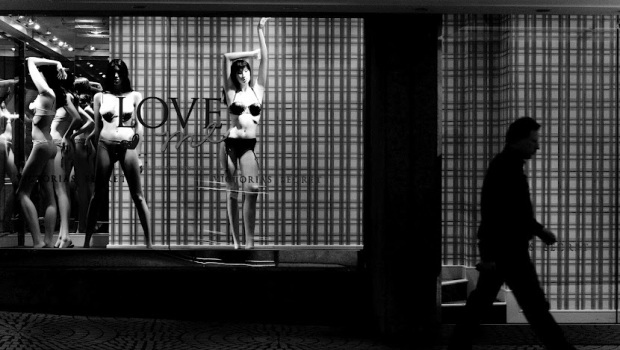
"Call it love and lack of love, or superficiality and vanity. Try for something we will never have, leaving us in a desperate hunger for more."
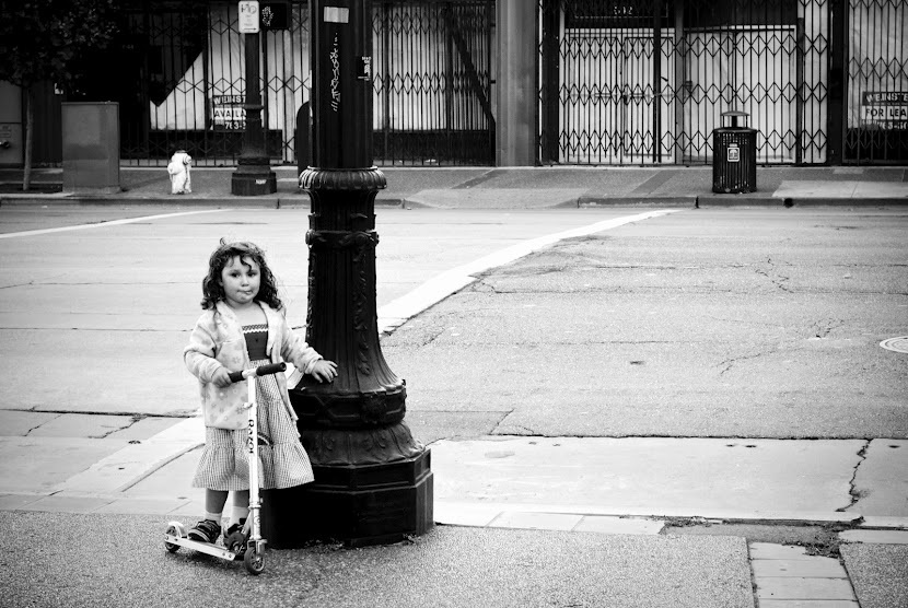
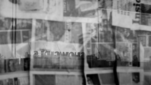
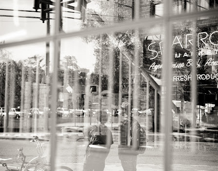
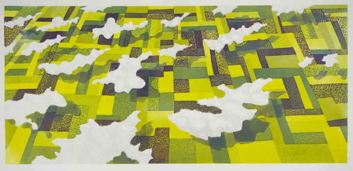
"Through the glass board with historical facts about Ann Arbor, the life on the other side, or dreamy layer, is created."
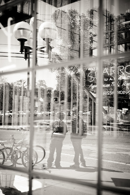
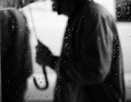
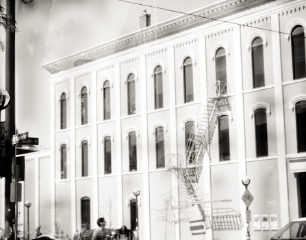
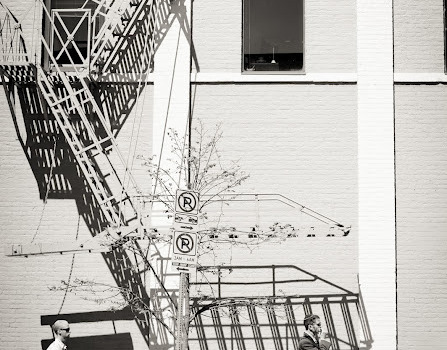
The shadows juxtaposed to the reflection and silhouette of the boys create an abstract and dynamic image.
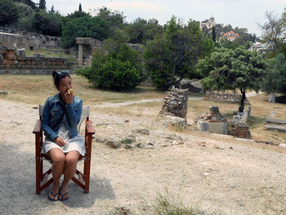
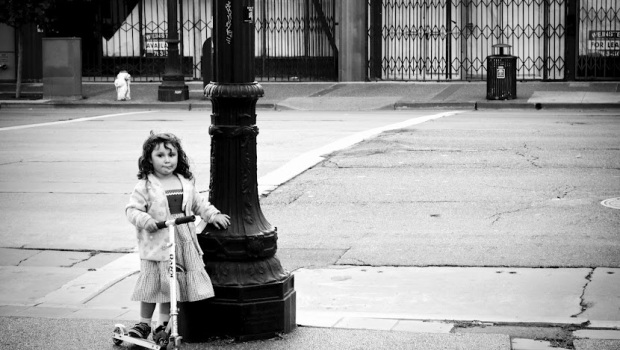
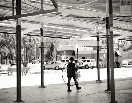
"With the girl with hula-hoop at the center, the space is perfectly balanced: the negative space of the sky mirrors the shape of the ground."
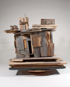
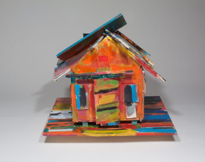
Interview with Beverly Buchanan
November 8th, 2012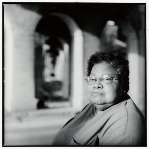
Throughout her three-decade long artistic career, Beverly Buchanan has painted and sculpted wooden shacks of the American South. Her latest exhibition, All in the Family, celebrated its opening last Friday at GalleryDAAS at the University of Michigan in Ann Arbor, featuring a series of Buchanan’s structures and paintings.
Buchanan was born in North Carolina but grew up in South Carolina with her great uncle, Walter Buchanan, who was dean of the School of Agriculture at South Carolina State College — the only state-supported school for African Americans in the South. Much of her work stems from her personal observations and experiences as a child.
A two-time recipient of the National Endowment for the Arts Fellowship and Guggenheim Fellowship, Buchanan’s name is often associated with the term, “Southern vernacular architecture.” However, though art critics deemed her paintings to be representations of the region’s historical racism and poverty, Buchanan insists that her pieces are based on real-life people and places. As an artist, Buchanan particularly pays attention to the structures and landscapes of her surroundings, demonstrating her talent for finding beauty in impoverished areas.
Now 72-years-old with works being exhibited across the country, Buchanan has remained humble and easy-going, constantly thinking up new artistic ideas. Art Animal had the opportunity to meet Buchanan in person to talk about her work and concepts of home.
Art Animal: When you think of home, what do you imagine?
Beverly Buchanan: Plants, weather, colors (of everything – trees, birds, dirt) and design. I like designs of trees and especially buildings. I like the weather here (in Michigan). I’m probably the only one looking forward to snow.
AA: What does the concept of home mean to you?
BB: It means what I’ve established and where I am, wherever that is. And it means South Carolina, where I grew up. It doesn’t mean, to me, where my family came from. My family came from wherever they came from, but I consider home as where I grew up.
AA: Do like to travel? Do you have any particular memories of travelling in the South?
BB: I loved it. Oh, yeah. One instance that still stands out in my brain is visiting a farmer’s plantation. There [was] lots and lots of corn and there was wind going -— it was almost like a song! Daddy said to me, “Do you hear the wind?” I would never forget that. It was so beautiful, I just said yes. So now I tell people, “you know, corn sings,” and they go “Oh, boy.”
AA: What has travelling given you and how does it affect you?
BB: One of the most wonderful influences for me was going to Copenhagen in 1980. There was a women’s arts conference and I was one of the delegates from the United States. I saw sculptures that I’ve only seen in books. I’d never get over that.
AA: How easy is it for you to get attached to a new place?
BB: It depends on what I bring with me to the new place. Familiar things help in adjusting. Chairs and pictures: they help.
AA: Do you believe somewhere else is always better than you are right now? In other words, do you believe the grass is always greener on the other side?
BB: It depends on the time of the day, the food that I’ve had and the weather. Right now, this place is just wonderful. Right now, at this minute, this place is just marvelous.
Beverly Buchanan’s exhibit will be on display until February 1, 2013 at the GalleryDAAS at the University of Michigan in Ann Arbor. For more information, visit gallerydaas.com or beverlybuchanan.com
Comments Off on Interview with Beverly Buchanan
Tell it like it is: the art of Young-Hae Chang Heavy Industries
November 6th, 2012
“LONG LIVE NORTH KOREAN CUNNILINGUS! LONG LIVE NORTH KOREAN COMMUNISM! LONG LIVE NORTH KOREAN SEXUAL EQUALITY!” states YHCHI at the end of Cunnilingus in North Korea.
The work resulted in a mix of praise and backlash from the art world.
“This year, not even in the span of a year but in the span of six months, four of our works in foreign countries have been rejected because of fear that something bad would happen to people, us, them,” said Marc Voge, half of the YHCHI duo.
Indeed, YHCHI isn’t afraid of pissing people off (“THE FOLLOWING IS A TEXT THAT NORTH KOREA’S DEAR LEADER KIM-JONG IL ASKED YOUNG-HAE CHANG HEAVY INDUSTRIES TO MAKE” plays at the beginning of Cunnilingus in North Korea). Formed in 1999, YHCHI members Young-Hae Chang and Voge express their philosophy on art and the world through their animated text pieces without attempting to hold back scandalous statements or ideas.
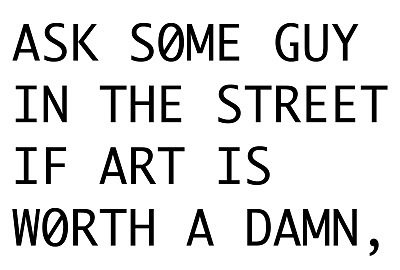
Having had works commissioned by the likes of the Pompidou Center in Paris, the Tate Gallery in London and the New Museum in New York City, Chang and Voge have clearly made an impression on diverse artistic communities. Their work is intensely unique, featuring animated black and white typography that plays over jazz music, the text usually mixing humor with philosophy and contemporary topics.
“EUREKA. NO EXCLAMATION POINT,” says one slide in THE ART OF SLEEP, displayed at the Tate Gallery. “IT’S TOO LATE AT NIGHT FOR EXCLAMATIONS AND CELEBRATIONS.”
Though the typography and style of YHCHI’s pieces are relatively simple, Chang and Voge are able to convey complex philosophies that vary in theme, but always manage to carry a playful, tongue-in-cheek quality.
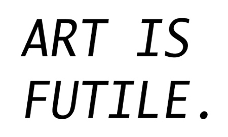
“EVERYTHING IS FUTILE,” says YHCHI later in THE ART OF SLEEP. “OK, SO I’VE HAD THE NOTION A FEW TIMES BEFORE. MAYBE YOU AND BUDDHA HAVE TOO.”
YHCHI’s works also often make textual references to historical artistic figures that fluctuate between idolization and ridicule.
“Other cultural influences in our work are Marcel Duchamp, who one day decided to stop painting, saying he was tired of getting his hands dirty,” said YHCHI in an interview with the Iowa Review, “Roy Lichtenstein, who found a simple artistic vocabulary, and stuck to it; and Andy Warhol, who, more than the Chinese government ever could, succeeded with his Mao portraits in putting a certain face on China.”
Outside of their onscreen text, YACHI itself maintains a certain distinct character. For example, during a recent lecture series at the University of Michigan, Chang played the group’s CEO while Voge was an employee of Chang’s Heavy Industries “company.” Voge did all the talking while Chang stood by to give an infrequent, solemn nod.
Voge, in character, said that art should be easy because life is hard. Artists don’t succeed by maximizing the correlation between an investment of time and energy and a substantial return. Because you can “bullshit your way through art,” artists live easy lives.
“ART IS EVERYTHING,” says YHCHI in THE ART OF SLEEP, eventually coming to the realization that if art is everything, who needs artists?
(Of course, this realization rings of irony since the text itself is part of a work of art created by artists.)
In essence, YHCHI’s work is not just funny, scandalous or outrageous: it is complex and original. Even if YHCHI’s works continue to be rejected and criticized by the artistic community, YHCHI will keep pushing the boundaries of art.
YHCHI’s exhibit will be on display through December 30, 2012 at the University of Michigan Museum of Art in Ann Arbor. For more information or to view their work online, visit www.yhchang.com.
Comments Off on Tell it like it is: the art of Young-Hae Chang Heavy Industries
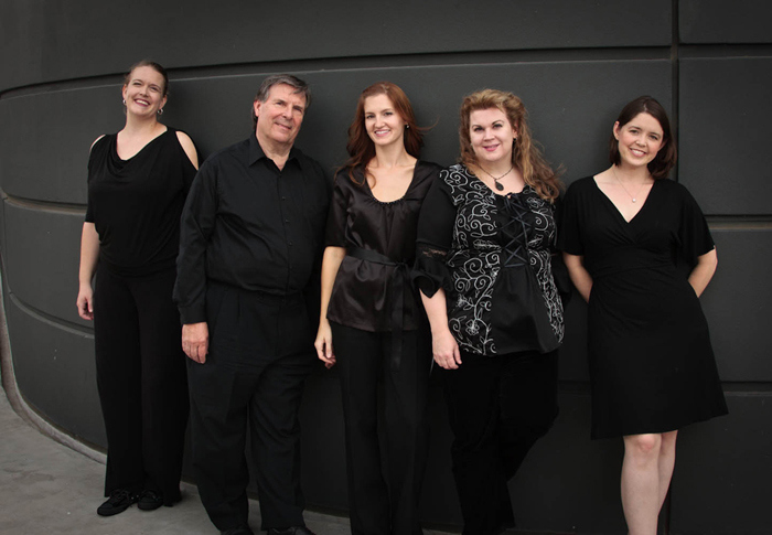
Armonia Celeste: Bringing Back Baroque
October 17th, 2012
Did you know that women were not allowed to sing in public until the 16th century?
Early music ensemble Armonia Celeste was created to remind listeners of this important development in history. Modeled after the first all-female ensemble of professional singers, Concerto delle Donne, Armonia Celeste brings back an early era of music that tremendously influenced subsequent generations of female singers: the Italian Renaissance and early Baroque periods.
Originally an amateur group of female courtiers, Concerto delle Donne arose during the late Renaissance in Ferrara, Italy and eventually evolved into an all-female group of professional musicians. The ensemble sang musica secreta, music performed for an exclusive audience in a private setting since women could not legally perform in public. The group performed regular formal concerts for members of the court’s inner circle and important visitors.
Of course, Concerto delle Donne wasn’t the only female group creating and performing music at the time. Nuns were actively composing music, too, but for the sole use of their own convent. What marks Concerto delle Donne as different from other 16th century female singing groups was its invitation for composers to write songs for them. Composers of the time, whether religious or secular, were limited to making music that did not include a treble part within the high, soprano voice range. When it did, boys or castrati performed the falsetto. Because of this, you can imagine how thrilled composers were with Concerto delle Donne’s success; they were finally able to compose pieces for a florid, lyrical and highly ornamented singing style.

“We’re almost at a disadvantage because this music was written specifically for people to hear in their own language,” Beasley said.
The ensemble consists of three female voices, a lute and a Baroque triple harp. The group’s expressive, warm and powerful voices are brought out with minimal accompaniment of the instrumentalists. Paula Fagerberg plays the triple harp while Lyle Nordstrom plays lute, therbo and the baroque guitar.
Though the group’s members live in different parts of the country, their love for early music clearly binds Armonia Celeste together, making for a unique performance of technically challenging music. The ensemble’s three singers—Rebecca Beasley, Sarah Griffiths and Diana Grabowski—have been singing together so long that Beasley said she feels that they are “living in each other’s heads” when they perform together.
Armonia Celeste’s latest tour, “Udite Amanti – Lovers Beware! – Music from the 17th Century Barberini Court,” consisted of five concerts in seven days, starting in Atlanta and ending in Ann Arbor, MI. Performances included pieces by Barbara Strozzi, Claudio Monteverdi and Luidi Rossi, all of the pieces composed solely for female singers of the time. The program’s selections progressed from the early stages of young lovers awakening to passion before delving into betrayal, suffering and unrequited love.
Much of this is due to the fact that there is a lot of room for improvisation in early Baroque music. Composers of the early Baroque period did not want to trap musicians into having to play certain notes on a page—a convention that came much later. Instead, composers wrote a single note (known as a figurative base) to tell musicians how the piece progressed. Singers receive as much musical freedom as the instrumentalists; nothing in the music keeps them from improvising, changing notes or coloring the tone of their sound.
“It’s kind of like someone hundreds of years ago said, ‘Oh, it goes something like this,'” Beasley said, “and then you’re supposed to get out your instrument, noodle around and make it sound something like that.”
In Armonia Celeste’s performance, the solo pieces were especially theatrical, as if they were reenacting a scene from an Italian opera. Beasley, Griffiths and Grabowski are all highly skilled at exposing raw emotion in their pieces, fueled by their dramatic facial expressions. In effect, the mood of the pieces shifted from hilarious and flirtatious to sad and tormenting.
The result was an emotional and lively performance; so much so that I nearly forgot I was listening to Baroque music. I was moved by the aesthetic beauty of the music’s Italian lyrics accompanied by the singers’ theatrical expressions. Though perhaps contemporary pop music will always remain on the forefront of live music performances across the country, I hope to see more of Armonia Celeste—and other ensembles like them—in the future.
To learn more about Armonia Celeste, please visit www.armoniaceleste.com
Comments Off on Armonia Celeste: Bringing Back Baroque
Project Photo shoot with Patricia Izzo
October 8th, 2012

Truthful and blunt in her artistic style, Izzo is a firm believer of connecting with people (not people’s couches) through her art. Izzo wants people to have an emotional response when they look at her art; she is more interested in touching a viewer’s emotions than creating a pretty picture.
Much of her photography shines light on humanity’s shared fears and collective triumphs. To accomplish this, Izzo frequently gives a voice to her photographs by including a line of text, taken from literature or written by her. It was her combined love for writing and photography that first inspired Izzo and I to collaborate on Project <ONE>, a photography collection that provides a female narrative to racial stereotypes. Adrienne Dunlevy, Amanda Puja and Nara Kim were the subjects, each taking on a different stereotype that they themselves had faced.
Taken in Trenton, Mich. at Elizabeth Park (one of Izzo’s favorite places to go for her work), the blue sky set against vivid fall colors made for an ideal spot for Project <ONE>’s photo shoot.

Although her work usually displays more of a subtle tone, Izzo decided to use highly overt messaging for this project. Izzo presents the text on each card in a way that doesn’t give outside viewers a chance to speculate on their meaning. However, she leaves a few details within the text’s style to differentiate between the three distinct stereotypes. For example, Izzo underlines both “CRACK” and “ME,” placing the cards next to each other in the photograph with all three subjects. The weight of the font varies (“crack” is lighter while “me” is a heavy, bold style), suggesting different emotions behind each statement. In the third card, “she doesn’t speak English very well,” Izzo capitalizes all of the letters except “l,” reinforcing the subject’s insecurity about speaking English. Similarly, the first card, “I’m off the creamy crack,” plays off of stereotypical African American vernacular. Thus, Izzo elegantly deepens the significance of the text in the photos, using small hints to reenforce that stereotypes run deep.
In addition to the cards, Izzo conveys her bold messages by bringing out a character through each of her subject’s stances, facial expressions and costumes. For example, two of the subjects are looking directly at the camera, making the third’s sunglasses and detached upward glance more noticeable.

In <ONE>, viewers can see the hidden lies that society perpetuates through subtle prejudice, exposing racist stereotypes through art. While we often don’t want to admit the truth, we are constantly fed falsely construed images by society. However, the irony of this piece comes out in its simple title: ONE. Each portrayed stereotype is ultimately brought together as one because the subjects still have one thing that binds them together and transcends racial stereotypes: they are all women.
Izzo’s most recent exhibition, “…but I am awake now” features works that helped her first awaken to the idea of becoming an artist. For more information about the exhibition and Patricia Izzo, please visit www.izzophotography.com
Comments Off on Project
Review of Detropia
October 2nd, 2012In the 1930s, Detroit was the fastest growing city in the U.S., due mainly to the automobile boom and WWI production of airplanes and machines. 80 years later, this same city faced the fall of an industry after GM’s and Chrysler’s bailout by the U.S. government. Today, Detroit the fastest shrinking city.
“The city is broke, I don’t know how many times I have to say that,” says the Mayor of Detroit David Bing in Detropia, a documentary by Rachel Grady and Heidi Ewing about the urban decay of Detroit. Bing plans to “repurpose the land” and bring together the scattered population of the city. Detroiters, however, have no intention of moving out of their current homes; some want to know what would happen to their habitation once they move out, others view downsizing as a form of segregation.
Recipient of the 2012 U.S. Documentary Editing Award at the Sundance Film Festival and winner of the grand jury prize at the Boston Independence Film Festival, Detropia weaves a complex story of ruin in Detroit through the eyes of local residents: a young video blogger rediscovers abandoned houses and concert halls; autoworkers negotiate wages with management shortly before discovering that the factory is closing down; and a local restaurant owner reminisces about the good old days when jobs were plentiful.
Detropia captures the rise and demise of the American manufacturing industry juxtaposed against job outsourcing and the Chinese automobile industry boom, pointing out that the fall of Detroit is not only the problem of Detroiters, but of all Americans. Characters in Detropia raise concerns that are not necessarily limited to their region: How did China see such rapid economic growth while Detroit is faced with bulldozed houses, abandoned theaters and closing schools? “What do the Chinese have that Americans don’t?” the film asks.

All in all, Detropia is a wake-up call, both to eradicate economic and racial tensions and to accept the city for what it has become. Cheaper production of automobiles by Chinese motor companies has provoked many Americans (especially Detroit residents) who are out of a job, and the film cautions against a repeat of Detroit’s race riots. Instead of positing the Chinese as a group of intruders, the film proposes that we learn from their successes. Detropia also calls for a new way of dealing with Detroit’s modern cityscape, criticizing city officials for wanting to “repurpose the land.” The city is a breathing thing, Detropia says. It has proved its gritty tenacity to survive even on the verge of bankruptcy. It can never be destroyed by force and will always seek a way to survive.
Want to see Detropia yourself? Visit detropiathefilm.com to find a theater near you.
Comments Off on Review of Detropia
A Sunny Artscapade with Street Photographer Yana Benjamin
September 16th, 2012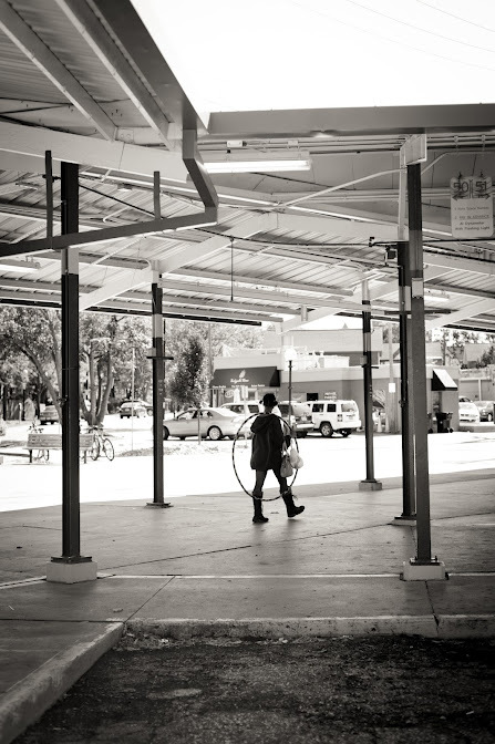
“With the girl with hula-hoop at the center, the space is perfectly balanced: the negative space of the sky mirrors the shape of the ground.”
Last Saturday afternoon, award-winning street photographer Yana Benjamin and Art Animal went on an “artscapade” on the streets of Ann Arbor, Mich. This experimental project was overlaid with the theme, Ubiquity of Urbanity.
While walking the streets and stopping to snap pictures here and there, Benjamin and I discussed her childhood hobbies, artistic influences and favorite photographers.
Benjamin has always had an aptitude for creating art. When Benjamin was younger, she grew up in Slovakia playing with her first camera, an old Russian Zorki, and making jars and other practical things with mud clay. Photojournalist and war photographer James Nachtwey was one of her favorite photographers (when asked about him further, Benjamin retorted, “That guy’s nuts.”). Robert Frank, best known for documenting American society in the 1950s, also caught Benjamin’s attention at an early age for his fresh and skeptical outsider’s perspective.
Now a professional photographer, Benjamin’s art clearly builds off of her childhood idols, juxtaposing reality against a reflection of reality and capturing an irreversible, visually complex moment without the aid of computer graphics.
“When I capture the moment,” Benjamin said, “it takes on a life of its own, the relationships of objects and juxtapositions taking on different denotations and importance. So the real becomes something else on a two dimensional plane. It becomes my reality.”
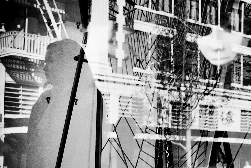
I explore the abstract qualities the complicated layers create, and this is not an easy image to look at with its multiple layers – the reflection of a building, woman, spider web, and mask. It was done in one shot, with no manipulations.
After studying photography in school, Benjamin worked as a street photographer in San Francisco. She was a winner of the Manfrotto Imagine More Contest in 2011 for the untitled picture of a woman next to a spider web, which competed against more than 7,000 photos. After moving to Ann Arbor, Benjamin did not invest as much time in her beloved street photography since the main reason for relocation was to start a portrait and wedding photography business.
“Here I have to create time for street photography,” Benjamin said. “In San Francisco it was created by itself.”
When asked to capture the urban scene of Ann Arbor, Benjamin confessed that she was intrigued but worried that she would not get any interesting pictures. In San Francisco she was able to capture a scene just down the street of her residence, while Ann Arbor has proven to be more difficult. Street photographers usually work in larger cities, where they are able to blend in with the crowd and shoot anonymously. Working in San Francisco, Benjamin was used to this way of working and could hardly imagine photographing Ann Arbor the way that she did in San Francisco or New York. However, though she admitted concerns prior to the shooting, Benjamin, adventurous in nature, was game for the challenge.
“I want to take pictures but they’re looking at me,” whispered Benjamin timidly, turning away from people behind the display window of the bucherie in Kerrytown, Ann Arbor. “I try to take pictures without people knowing it.”
“And I never ask for permission,” she added, turning to capture a few candid shots of people buying and serving fish.
Given Benjamin’s surreal style of street photography, which is focused on capturing reflections through glass windows, her attitude makes sense. It is only when people are unaware of being caught on camera that she is able to capture their natural, unposed movements. As a result, her photos rarely display subjects’ faces.
Of course, wedding photography is an entirely different genre that hones in on faces, so Benjamin has had to adjust her artistic style. The truth is, she sees a big difference between the two: while street photography is about creating the moment, wedding photography is about capturing the moment.
“Street photography is about seeing the unseen and creating visually interesting comparisons, often pretty bizarre images that can never be duplicated,” Benjamin said. “In wedding, and, generally speaking, event photography, the scene is already there. You are the observer, not the creator. You just have to click at the right moment to capture it.”
However, she added that it is just as important to feel artistically inspired in wedding photography as it is on the street.
“My father told me once, ‘there is always a subject to photograph no matter where you are,'” Benjamin said. “It is upon you to successfully tell a story.”
As it turns out, Benjamin told me, her father was right. Though she had her doubts, Benjamin confirmed that the “artscapade” with Art Animal was a great inspiration to her personal work, resulting in nine photographs that beautifully capture the people and architecture of Ann Arbor. In the near future, Benjamin plans to photograph the streets of Detroit.
“[If you look for it,] you can find an urban scene anywhere,” Benjamin said.
To learn more about Benjamin’s other works, visit www.yanabenjamin.com


Comments Off on A Sunny Artscapade with Street Photographer Yana Benjamin
Artist Elizabeth Busey’s “Connections: Linoleum Block Prints”
September 11th, 2012
Busey believes the nature of her work is compatible with the areas of healing, which is why her exhibition, “Connections,” a collection of 16 linoleum block prints, is currently on display at the Gifts of Art gallery in the University of Michigan Health Systems. Here, the arts are combined with an environment of care, providing comfort to the patients.
“Our experience with nature, in one sense, is very communal and shared. In another sense, we can have different reactions to what we see,” Busey said. “But there’s sort of this knowing that we’ve seen this before.”
Busey is most interested in working with forces that shape the world – growth, pressure, erosion, and decay – and the patterns created from them. These patterns evoke in her feelings of excitement, grandeur, stability, peace and strength.
A self-taught printmaker from Bloomington, Indiana, Busey says printmaking is all about taking ink and using matrices to put it onto paper. Relief printmaking uses either a woodblock or, in her case, a block of linoleum (linoleum in printmaking is cheap, easily available and easier to carve than wood).
Originally from Asia, printmaking has historical roots going back hundreds of years. By the time it hit Western Europe printmaking was being used to illustrate the Bible. Artists of the past such as Rembrandt, Goya, Degas, Picasso and Warhol made great works through printmaking medium. However, a lesser known fact is the technical legacy of the highly toxic environment of printmaking studios. Busey worries about this aspect to her art since her basement studio doesn’t have a great ventilation system, making her extremely careful in using toxic products.
But printmaking isn’t all bad, of course. Busey loves the fact that printmaking is fairly unpredictable; though she has control over what she carves, there is no control over how the ink will act.
“It’s kind of like an adventure,” Busey said.
Just like watercolor painting, she must carefully control the spread of ink on the print. For a long time the biggest challenge for printmakers has been learning to line things up because otherwise you end up with a sloppy product, and you can’t reverse your mistakes and go backwards. By the time Busey finishes making a print using transparent layers of color, there are usually eight to ten layers of carefully set ink.
“I hope that my prints make people stop and ponder a little bit,” Busey said.
<em>Busey’s exhibition in the Gifts of Art gallery in the University of Michigan Health Systems started August 20 and goes through October 8.</em>
Comments Off on Artist Elizabeth Busey’s “Connections: Linoleum Block Prints”
Interview with photographer Patricia Izzo
September 5th, 2012
In 2011, a fire in her studio destroyed 30 years of works, and Izzo “began at the beginning.” Right after the fire she stood on the precipice for a while, wondering where to begin if she could begin again. Then her creative energies began to flow as freely as they did before the fire and her urge to create became abundant. Born from both joy and pain, the fire has immensely inspired her later works, especially the Fragile Awakenings collection, exhibited at Rivers Edge Gallery in Wyandotte, Mich.
Izzo’s work since the fire has had more finite tones to it as she realized nothing lasts forever.
“My work has risen from the ashes, like the human spirit does after it has been crushed,” Izzo said.
She believes all people are made of strong, indefinable soul and when they find the beginning, they simply do the next thing. This is also the reason Izzo teaches painting to at-risk children at the Opportunity Center/Guidance Center in Wyandotte. Izzo says her job is to not necessarily teach but guide the children from backgrounds of unfortunate family circumstances, such as drugs, alcohol, poor parenting and poverty.
Izzo believes that art heals; as a facilitator, she guides the children to find their own creative DNA, which, once nurtured, nobody can take from them.
As an artist-in-residence at Rivers Edge Gallery, Izzo is a member of the National Women’s Caucus for the Arts (NWCA). (The Michigan chapter of NWCA recently hosted an exhibit called “Man Up! No Balls About It” at the University of Michigan last July.)
“We tackle feminist topics, social and global, through art,” said Izzo of the NWCA. “Personally, it has opened doors to a bigger purpose of what my art can add to this world.”
Izzo’s photography has been featured in many publications. The movie Harold and Kumar 3 features a few of Izzo’s floral works, “Lush” and “Rose Herself.” Currently, Izzo works with two other artists, Barbara Melnik Carson and Birgit Hutteman-Holtz, on a traveling exhibit called The Affairs of Serpents, Heroines, and Saints.
Izzo took a few moments to talk with Art Animal about her inspiration for Seduction and Desire and her plans for the future.
Art Animal: Your Seduction and Desire images implicates that people of all colors, sizes, shapes, appearances, religious beliefs and sexual orientation are seductive and desirable; to do this, you must need to find models who are comfortable with a provocative theme. How do you recruit your models?
Patricia Izzo: I do not use professional models but people who have in some way felt a little of where my image is headed. Most of the time, the collaborators come to me. They are friends, people I know in the arts, or just someone I meet along the way.
Having said so, I — with the collaborators — record the beautiful struggle that we go through as humans. It is the proof that we were here, and something to leave our future generations to learn and enjoy from.
AA: On your website you mention that each image of Seduction and Desire began as something hidden that longed to escape or to be known. I am interested to hear your process in collecting inspirations for this specific collection. Do you begin with the image or the words that tell the story of the image?
PI: Words are huge inspiration to me! I love to define the word or phrase that conjures up an image. Sometimes the image comes first, other times the words, but they go hand in hand when I am creating. My titles are used to help the viewer along but not hinder them in their own interpretations. One of my most favorite creating encounters is to sit and have coffee with a collaborator.
PI: Life ties the images together. That is to say, the search for what part of history resonates with you. What part of pop culture can you belong to? What secret desires do you have? What archetype are you? What part of nature holds the magic for you? And what is the seduction of life to you? It is wide open for interpretation. I create with as little instruction to the viewer as possible. I hope my work seduces you to explore yourself.
AA: You ask viewers to “step out of line” and break the conventions of “polite society” in order to really connect with the images. What do you think is special about these images that they allow the viewers to draw personal meaning?
PI: For me, the collection begs the question, “What is desire?” Who decides what is most desirable? I am not afraid to push the psychological barriers and bring to light the ideas we tend to keep to ourselves.
PI: I believe in the “divine body sacred,” which I define as all female form is beautiful, and I celebrate it from a female artist’s point of view. Not only do our bodies give life, but are sensuous, powerful, erotic without being pornographic. They are simply beautiful in every shape, color and size. The diving Body Sacred, or the elevated “art nude” is always an inspiration to me. One of my favorite images on female identity is “Savage.” This piece was just in an exhibit called “Rage at the “Soho20Chelsea” gallery in Soho, New York City. “Savage” represents the primitive instinct of a woman that is the less represented side of femininity: not the nurturer, but the protector. When her children or those she loves are hurt or in danger, she changes from lover to animal warrior pretty damn quick.
AA: The collection is also philosophical at times, seen in pieces like “Chains that Bind,” allowing the reader to ponder upon the dividing lines between beauty, seduction, desire and obsession. What do those words mean to you and how did you reveal them through your works?
PI: “Chains that Bind” represents the oppression of the beautiful, and is a perfect example of how people, born socially accepted as beautiful, have a hard time getting rid of those massive chains. They may never reach their full potential due to the preconceived stereotypes of the beautiful. This is a twist, of course, on all the other stereotypes that are just as limiting and destructive to woman.
AA: Any artistic projects in mind for the near future?
PI: I have an exhibit coming soon called “But I am Awake Now,” which I am feverishly working on with all the passion I can possibly shoot, paint and create with! The exhibit will be a selection of classic black-and-white film prints on cold-pressed watercolor paper, hand-painted film photographs on large artist canvas and small, stretched canvases with images and words working together. The opening of this exhibit will begin at Rivers Edge Gallery on November 10, 2012.
AA: Any final comments to Art Animal?
PI: One of my favorite quotes is, “I am not afraid. I was born for this,” by Joan of Arc. It sums up my approach to working as an artist.
To learn more about Izzo’s works, visit www.izzophotography.com
Review of Judith Turner’s The Flatness of Ambiguity
August 28th, 2012
Think of a time that you’ve been at an exhibition you’ve been meaning to check out for weeks: as you walk into the exhibition you admire the spotless, high ceiling and decide to work your way from the left wall around the room, keeping a regular distance from the artwork on the walls. You are looking at the pieces, but your eyes graze over them; suddenly, you realize that you are not quite sure what you are looking at – you are drawn closer to the pieces on the wall and you find yourself staring at each piece for minutes at a time in order to fully appreciate their depth.
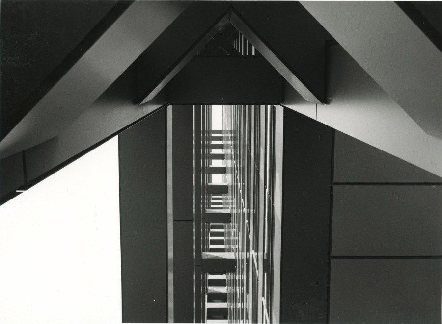
This most accurately describes my experience at Judith Turner’s exhibit, “The Flatness of Ambiguity“ at the University of Michigan Museum of Art. Turner, an avant-garde American photographer, is an expert at capturing the abstract beauty of architecture by playing with distorted angles, light, scale and perspective until viewers are not quite sure what the subject is. The exhibit featured 40 photographs that span Turner’s impressive three-decade career. She has photographed buildings by major architects of our time, including Shigeru Ban, Frank Gehry, Zaha Hadid, Louis Kahn and Fumihiko Maki.
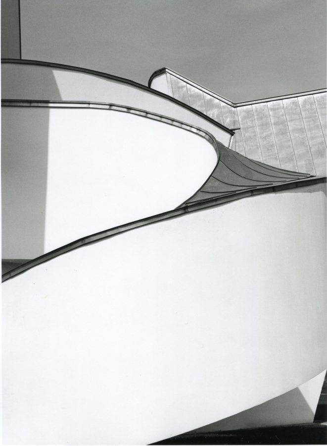
Rather than photographing entire buildings, Turner’s black-and-white compositions focus on graceful lines and shadows of the architecture. By distorting the three dimensional buildings, Turner is able to disengage lines and shadows from their original meaning, capturing them in their raw form and transforming them into something new. For example, her interior shot of Frank Gehry’s Vitra Design studio in Germany resembles gentle ripples in a river. Turner also plays with her composition by placing the object above eye level, making her photographs seem all the more illusional. It is as though she knows the architect’s deeper intention because her photography hones in on the graceful details of individual shapes – or shapes within shapes – setting them off with shadows that break into one another. In a beautiful twist, the composition becomes more than just shapes and shadows, seeming more like thoughts – or something equally abstract – that are branching out from one another.
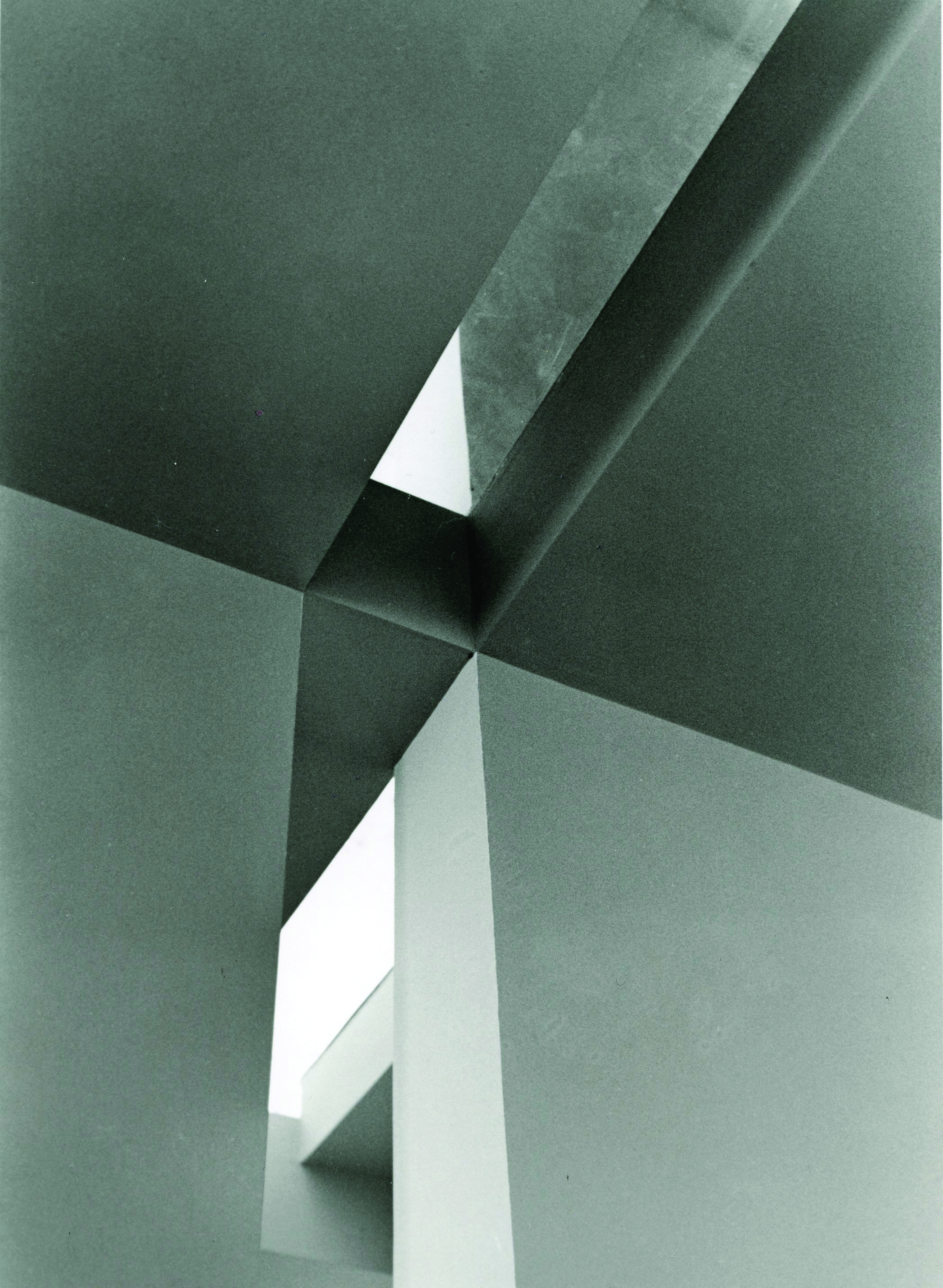
Many of her earlier works are more abstract and have a centerpiece to focus on – a point on top of a curvy rooftop, columns fading away to a central focal point and abstract shapes – while her later works are far more concrete. This is because most of her earlier works were taken with the camera zoomed in, focusing on one interesting point in the architecture. Her later works are more interested in playing with lines and shadow in the context of a larger landscape, making it easier to decipher more details about the subject. She seems especially interested in photographing spiral and linear stairs, creating exceptionally beautiful compositions just by taking photographs from different angles. But throughout it all, Turner’s work maintains her unique talent to find and capture exquisite beauty in the abstract.
To read more about Judith Turner, check out her book Between Spaces, which shows her architectural photography in the context of the featured buildings’ floor plans.
Comments Off on Review of Judith Turner’s The Flatness of Ambiguity
Interview with Artist Kristine Campbell
August 21st, 2012
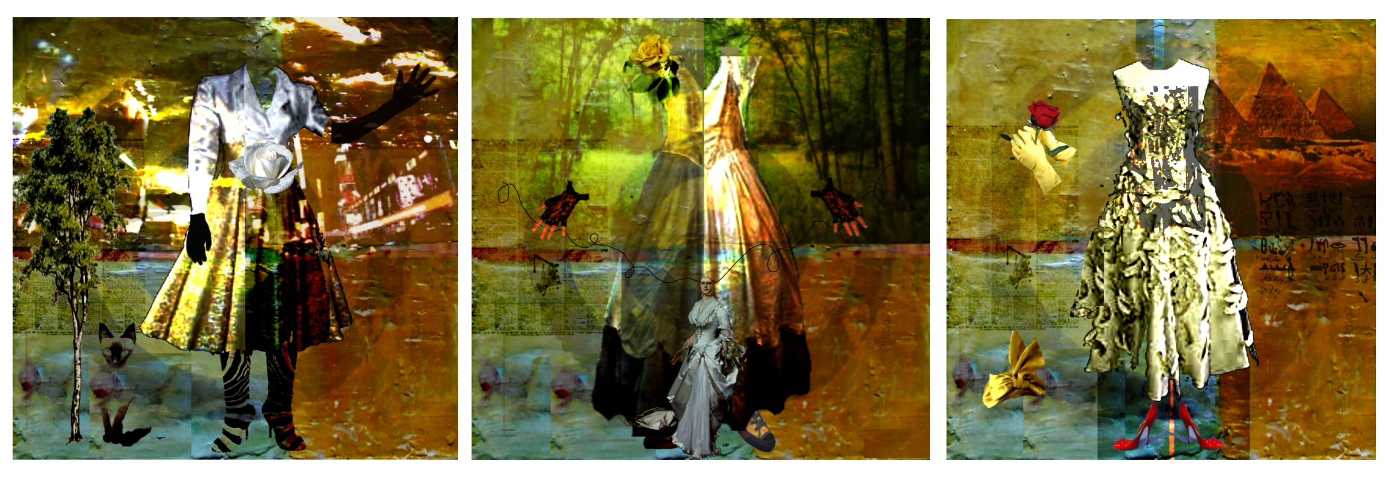
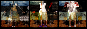
Michigan-based artist Kristine Campbell continues to use the tradition of the image of the dress as representative the female form while transcending its gender-specific connotations. In her exhibition, Dress Series, Campbell investigates how the dress is perceived without the distraction of an individual figure or facial features, consequently challenging the manifestation of a dress as a woman’s property.
Dress Series is composed of 16 wood panels. Each panel is square and sized differently, ranging from 10-by-10 to 30-by-30 inches. At the center of each panel is a genderless figure in a dress with gloves and shoes, standing in front of a surrealistic, dreamy background.
Campbell likes to work in series with a common central image because it gives her room to fully study a particular theme or object. Some of her panels are paired together in order to investigate more specific themes about the dress; for instance, the two panels in Birds are Not the Target play off of artist Jasper Johns’ famous paintings of the target, using the same image to instead represent women’s issues being targeted in the media.
Campbell took a few moments to talk with Art Animal about her inspiration for Dress Series and her plans for the future.
Kristine Campbell: As I work on a piece titles seem to suggest themselves. I have never worked to “find” a title. When I began to work with encaustic [hot wax painting] I went to the Whitney Museum and MOMA to view some Jasper Johns work in that medium. Early in my study of other artists’ work I was drawn to Johns and Robert Rauschenberg, but when you work in the same medium it is much easier to feel a connection. Because targets were a big part of Johns’ early works I wanted to incorporate that image in some of the paintings. Also, the current news dealing with women’s issues brought those two ideas – gender and target – together for the Birds Are Not the Target series.
When my mother passed I inherited many boxes of gloves of all types and colors. They began appearing in my work and I liked that idea of movement and gesture with the gloves, so Variations came out of that. When I lived in NYC I worked in a gallery on Spring Street. Still working with the gloves as side objects I explored the idea of different locations and kinds of movement like hailing a taxi, working with puppets, holding flowers, etc. In some disjointed way these [globes] reminded me of my time on Spring Street.
AA: All of the titles aforementioned are presented in series of three. Why do you produce them in series?
KC: I don’t always work in threes. The Teacup series, for example, began with six but has grown to nine, and I am still working with that idea. The process of most of my work begins with pencil sketches or charcoal and then watercolor to lay out the central idea and design. Next those ideas are developed further on the canvas or panel, or more recently utilizing the computer to aid in visualizing the final piece. I generally work on two or more pieces at the same time. In this way pieces evolve with the same palette and general theme. Series work with a common central image [and] allow for a full investigation of an idea or concept.
AA: What inspired you to create the Dress Series?
KC: For the most part, the dress image worked as a placeholder for the concept of female, but not exclusively. I wanted it to be less about gender and more about story but I realize that dress does have that strong female connection. I do like fashion and fiber art so it is a nice meld to be able to explore ideas of landscape and story and use the dress as a centerpiece or holding image.
AA: How long did it take to complete the Dress Series project?
KC: It continues. I made the first sketches more than three years ago, now. I did some early small paintings but have continued to work on those images for the past few years with some interruptions to do other work.
AA: You divide the panels into different color schemes and landscapes. How do you get your ideas for the composition of the panels?
KC: I’ve always liked the idea of having “frames” in one panel. In my early work, I usually had one side in a darker palette and one in a lighter. Now, the frames may have only slight color variations but I still like the idea of shaping a scene in two or more different ways.
AA: Some panels had a geometric shape of a target in various forms, sometimes overlapping with images, other times actually presented in the panel. The bull’s eye is always centered on where the genitals should be in the dress. What inspired that focal point? KC: It is interesting that you say that. What you have mentioned had not occurred to me but I like to hear other interpretations. Or perhaps it was a subconscious placement. I know the idea of targeting women certainly has come up but not the placement as any attributable construct.
AA: Your panels are undoubtedly filled with stories that are easily visualized from the various images such as wings and the blue sky, legs visible under a skirt, birds, newspapers, roses and different landscapes. Do you usually have a story in mind for each panel?
KC: I think of my works as stories, that’s true. What begins as static images, particularly that central image, often moves toward narrative as I paint or fit sections together. I don’t have a story in mind when I begin. I do love socks and have drawers filled with colorful, image-laden pairs, some of which have found their way into paintings.
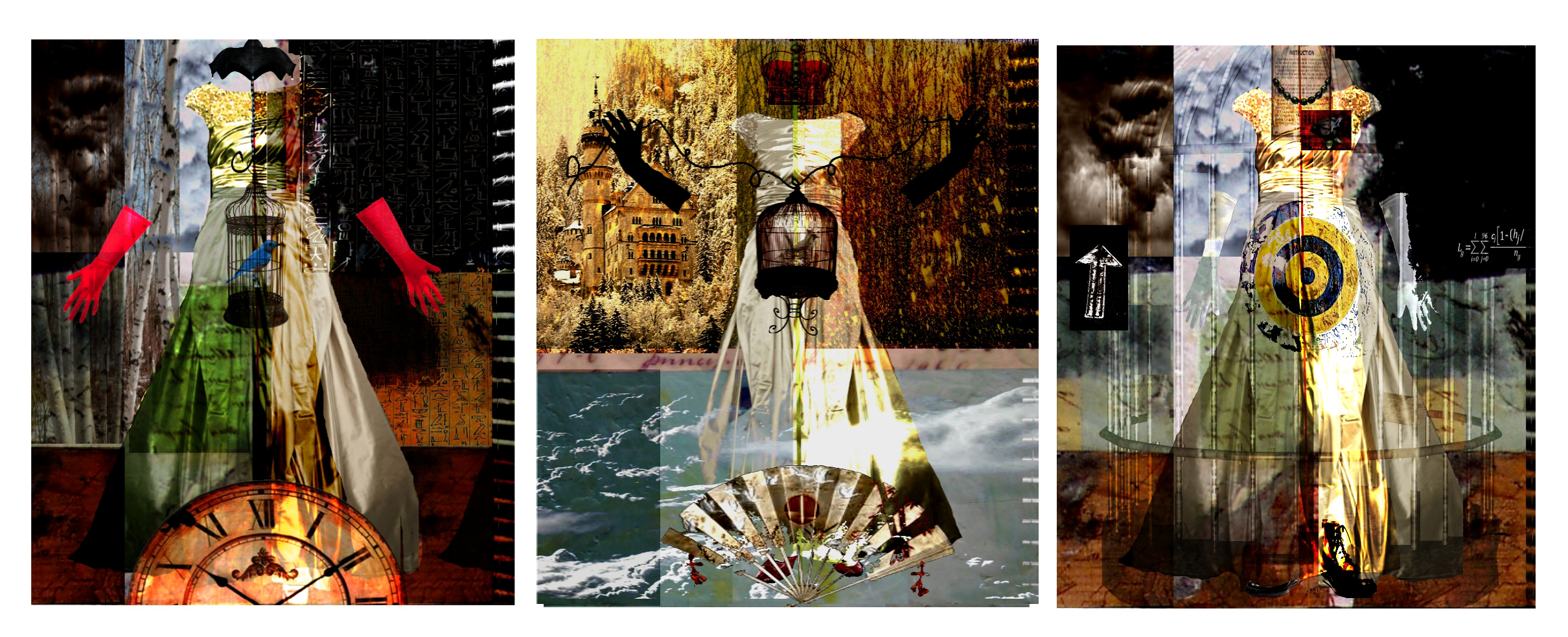
KC: The works in this series were constructed using mixed media and encaustic on wood panels. I like the idea of a “floating” image. Because the beginning sketches were conceived from memories of old family photographs, the type of media was selected to produce a final image that would appear ethereal or floating. I turned to encaustic to achieve that result. I don’t use stencils but I have manipulated paintings in many ways. I have used a computer to better visualize the final image. Once the image is finalized in my mind I begin to paint, print and layer with wax.
AA: I am fascinated with the idea of dress as a symbol to represent women itself, without the distraction of an individual figure or facial features. How do you explore the female identity through Dress Series?
KC: This is one of my favorite questions that people ask. People seem interested in why there isn’t a figure, or more importantly, a face in some of the paintings. You have answered it as I do. The figure is not only a distraction but as soon as a face or figure is used it becomes someone, a stranger the viewer does not know. This removes the viewer from seeing the work as something they can interpret or become a part of. By leaving the form unexplained the viewer is persuaded to work out the ideas for themselves. I don’t want to give the viewer any preconceived answers.
AA: Although the figures on the panel are in a dress, they do not seem particularly female. The figures reminded me of two instances in the news recently: a preschool boy wanting to wear a dress to school and fashion designer Marc Jacobs showing up at the 2012 Met Gala in a sheer Comme des Garcons dress. So here’s my long-winded question: is your work an interpretation, commentary, or critique of the fashion world?
KC: This is good to hear. I hope that fashion becomes more about personal choice and not gender-specific dictates. I think of fashion as wearable art and runway shows as performance art – moveable fibers. I really like this idea of the dress not defining one gender and was hoping to transcend that idea in this series.
AA: Your panels have dark color schemes overall, which I personally thought balances the femininity of the dress. What is the role of the dark color scheme in the Dress Series?
KC: Maybe it is an ancestral bent, which has been suggested, but I love dark, gloom and rainy days. My heritage is Scottish and I feel a little sad on very sunny days. My favorite paintings utilize a darker palette. I will say that the dark paintings have a more difficult time finding an audience. I did a Sunflower series a few years back that was very popular but it felt outside my nature to paint them so it was a short-lived excursion.
AA: I believe your premise on the Dress Series is for the viewer to create their own perceptions about place and time through a single image. How does the Dress Series challenge the viewer’s preconceptions and perceptions?
KC: In the ways you have mentioned, I hope. I like the idea of the paintings standing on their own with an individual story invented by each viewer and not just pertaining to a particular gender.
AA: Any final comments to Art Animal?
KC: I have enjoyed hearing your interpretations of my work. As an artist working in my studio I create a work never knowing if there will be a connection with anyone else. When the work is exhibited it is the first time I have an opportunity to have a dialog with the viewer.
“Birds Are Not The Target #1“ was selected by writer Christopher Barzak to appear as the cover for his book, Birds and Birthdays. Campbell’s work has been exhibited in the United States, Great Britain and Australia. Her works are currently on exhibit in Boston, Ludington, Michigan, and Asheville, North Carolina. To purchase or learn more about Campbell’s Dress Series and her other works, visit http://kristinecampbell.webs.com.
Comments Off on Interview with Artist Kristine Campbell
Identity and Sex in Man Up! No Balls About It Exhibit
August 16th, 2012
The exhibition was put together by the Women’s Caucus for Art (WCA), a national organization that creates community through art, education and social activism. Suzy Lake – a native of Detroit and the first female artist to use performance, video and photographic work to explore gender – acted as the jury for the exhibition, hand-picking the pieces and American female artists featured.
On Thursday afternoon, the gallery was empty except for Brenda Oelbaum, the receptionist at the gallery and president of WCA, who greeted me from behind her desk. As I wandered through the exhibition, I was greeted with a few unexpected surprises: though each piece of art was submitted under the same theme, the exhibition was incredibly varied, ranging in talent, genre and media. I was also delighted to find a diverse array of interpretations of the theme; some of the artists focused on the transformation of identity and gender, while others examined sexualization.
A few of the artists displayed pieces with political overtones, like Priscilla Otani’s He’d Never Seen Her Out of Uniform. The piece gets its title from a famous flub by the former mayor of San Francisco, Gavin Newson, when he failed to recognize Heather Fong, San Francisco’s former police chief, out of uniform at an event. As Otani notes, during her years as police chief, Fong was often criticized for keeping her private life separate from the public. This simple fact could be seen as a larger statement, bringing to mind other well-known female figures who are famous more for their controversial relationships or fashion sense than their personal achievements.
Lake herself showcased pieces that fit the theme of the exhibit, choosing – unlike Otani – to explore self identity in relation to “manning up.” Known for exploring the politics of gender through the deconstruction of identity, Lake has been showing her art since the late 1960s alongside other fantastic female artists, like Cindy Sherman. For Man Up!, she chose to exhibit Transformations, a set of six photographs showing Lake in the first three and her personal friend Jay Lee Jaroslav in the second three. As Lake’s photos progress, her eyes and mouth gradually transform to resemble those of Jaroslav. Conversely, Jaroslav’s eyes and mouth are gradually blacked out, rather than transforming into those of Lake. The photos are left open for many interpretations, possibly symbolizing the annihilation of Jaroslav’s masculinity or the impossibility of Lake becoming a masculine figure.
Jessica DeAngelo, a student on the campus, walks by the gallery quite often on her way to class. Transformations first caught her eye and enticed her to check it out even before the exhibition opened.
“It kind of reminds me,” DeAngelo said, “to be honest with you, the yearbooks where the females would scratch out the guys that have pissed them off [and] put the exes through their faces.”
Transformations is meant to play with the questions of identity, gender confusion and misrepresentation, displayed through a raw transition that is not smoothed over with digital technology. Indeed, WCA president, Brenda Oelbaum, found the true significance of Tranformations to be in Lake’s ability to produce such a polished piece before the computer age.
Similarly, Minnesota-based painter Patricia Olson played with personal gender identity in Self-Portrait at 60 [after Beckmann], mimicking German painter Max Beckmann in his 1907 piece, Self Portrait in a Tuxedo. However, Olson changes one small but important detail: she substitutes a cigar for a tampon in her hand.
Painter and California native Maxine Olson took the theme in a different direction, exhibiting three images of men’s crotches with the intention of displaying men as sex objects in the world where women are usually in that position.
Oelbaum herself chose to depict a more explicit interpretation of the term “manning up” in Family Jewels, using glass paperweights to display photographs of strangers’ penises. Oelbaum stated that the exhibition’s theme sounded more like a “hard on” to her. Like Olson’s three paintings, Oelbaum states that she wanted to shift the paradigm of “men see, women are seen.”
Another explicit work in the exhibition was visual artist Lauren Kalman’s Spectacular, a video performance featuring two women wearing oversized testicle and penis costumes. Through the video, she critiques the fashion industry’s ability to sexualize the experience of pain, disfigurement, illness and abnormality, essentially promoting suffering as a desirable aesthetic.
After seeing all of these amazing artists’ works, I realized I have been using “man up” and “don’t be a pussy” incorrectly. Now, I know the correct way to say “man up” to a woman: “Woman up! Don’t be a dick.”
Comments Off on Identity and Sex in Man Up! No Balls About It Exhibit
Patti Smith Reveals Hidden Artistic Talent in Camera Solo
August 16th, 2012“Each picture is individual and I could tell a little story about every one of them.”
– Patti Smith
I must admit, I didn’t know much about Patti Smith (perhaps due to a generational gap) until I read news about her exhibition, Patti Smith: Camera Solo, in the Detroit Institute of Arts. Many know her as the “Godmother of Punk,” a long time rock-and-roll singer-songwriter from the 1970s, who toured the United States and Europe as popularity of punk rock grew.
Only few people would, however, recognize her as an artistic photographer. Though she began to pursue the art of photography following the death of her husband in 1994, this marks Smith’s first solo exhibition of her work – all taken in black and white with a Vintage land 250 Poloroid. Spanning decades, the exhibition captures the essence of the people and places she has directly and indirectly observed as a rock-and-roll singer, traveler, lover, friend, daughter, sister, and mother.
In the era of digital imaging and manipulation, Smith’s works champion the use of photography in its most classical sense: as a tool to document and capture a found moment.
As a rock star Smith travelled. A lot. But she must have loved it because she always brought her camera with her, just for those precious moments when she could snap some photos of the places she’s seen.
“Being a singer I’ve been in as many as 32 concerts in 40 days while on tour,” remarked Smith in an exhibition comment. “I always bring my camera and try to find something that speaks of each city. I try to capture an essence of a city in one shot.”
However impossible it sounds to capture the essence of an entire city in a single shot, Smith manages to nearly achieve it, carefully capturing the soul of her subject in her own unique way.
“Because I only took films in packages of 10 for each trip,” Smith remarked, “and as the Polaroid films are becoming more rare, I must think about each one of the pictures.”
The subjects of her photos range from portraits, to landscapes, to inanimate objects. Studying Smith’s snapshots of Paris, Ghent, Rome, Glasgow, Cyprus and other exotic places provoked wide-ranging emotions; I began to long for travel, envy her travel and dream of going to those places someday, though they exist in a different time on film.
Smith’s photos of inanimate objects spoke much about the famous individuals associated with them; for instance, a photograph of a chair owned by Roberto Bolano (a Chilean novelist), evokes the endurance and persistence of the great writer who sat for hours on end writing his masterpiece, 2666.
Smith was clearly interested in the lives of long-gone artists, seen through photographs of Frida Kahlo’s Dress, a bear with a calling card tray in Tolstoy’s home in Moscow and Hermann Hesse’s typewriter. Interestingly, she herself made rock-and-roll history, yet she recorded – and maybe wanted to live – the history of other artists.
In addition to the inanimate objects of other artists, Smith also captured objects of a more personal note, symbolizing her love for her lover(s), children and family.
“It’s a fine porcelain coffee cup issued for Charles Dickens’ centennial that I bought for my father at Dickens’ house in London,” remarked Smith in a comment found below My Father’s Cup. “My father loved it and nobody was allowed to drink from it. When my father died, my mother gave it to me. It’s in a special glass case, and though I often take it out and look at it, I would never drink from it.”
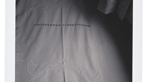
What particularly caught my attention, however, were the photographs of beds and tombs. Though not juxtaposed on the same walls of the gallery, both the bed and the tomb images convey similar themes of a space that is at once lonely and completely one’s own.
“I took the image of Jim Carroll’s (1949 – 2009) bed days after he had passed away on September 11th in NYC,” remarked Smith in a comment below Jim Carroll’s Bed. “He was my friend and the most beautiful poet of my generation.”
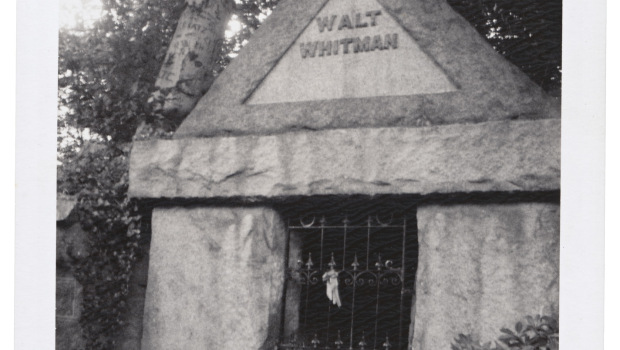
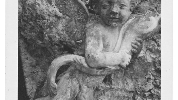
Beds once occupied by Virginia Woolf, Frida Kahlo, Victor Hugo, and John Keats were also photographed, and eerily all made out of wood and covered in white sheets. Contrastingly, photographs of the Pere Lachaise and Montparnasse cemetaries in Paris display tombs that are beautifully decorated with statues of Psyche and Cupid standing nearby.
The last image of the gallery is of a room called Camera Solo in Castello Longhi de Padio di Furore, where Pope St. Celestine V was imprisoned in solitude before his death. Fascinated by the idea of “myself alone,” Smith then decided to name her exhibition after this somewhat gruesome place.
But though the exhibition is titled Camera Solo, Smith shows through her art that she was never in fact “solo” while photographing. Rather, the exhibition displays her love of people, of traveling, of family and friends; essentially, Camera Solo is entirely dedicated to not being alone and instead involving oneself in the beauty of other lives and relationships.
Comments Off on Patti Smith Reveals Hidden Artistic Talent in Camera Solo